top of page
The Statistics Of the Hmalayan Alpine
In this first graph it shows the average temperature in Nepal. The red line shows the max temperature, the dark blue line is the minimum temperature, and the purple line is the average temperature.

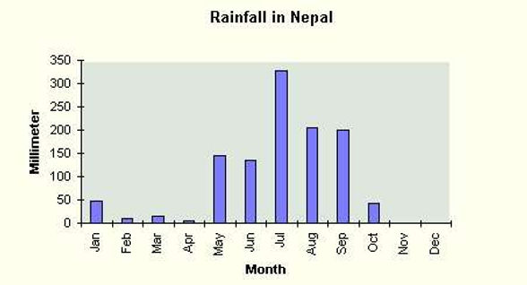
In the second graph it shows the average rainfall in Nepal. As you can see there isn't a lot of rain but there is a decent amount. The northern states are the most mountainous. The higher the bar, the more rain.
In the third graph you can see the population of Nepal (in millions) over the last 10 years. As you can see, it has gradually grown. The total population is 28,51,000 people as of right now.

bottom of page